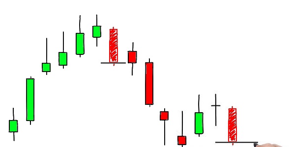

This lesson is an overview of candlestick charts. There is a vast information on candlestick charting, however this lesson it will cover the basics of it to get you started on learning it. More in depth information are provided in next lessons.
The roots of candlestick charting is believed to have originated sometime around the 17th century in Japan by a Japanese rice trader to help forecast rice prices.
A legendary rice trader named Homma from Japan is said to have made a huge fortune using candlestick analysis.
Candlestick charting was introduced to the Western world by Steve Nison in his book, Japanese Candlestick Charting Techniques. He is credited with modifying and popularizing the style of candlestick charting that is used today.
The Candlestick


Candlesticks have become very popular among traders because it gives a very good pictorial representation of the price action.
A candlestick chart is similar to a bar chart, but is different in the way it is constructed. A candlestick features four data points: an open, a high, a low, and close.
Called a candlestick because it simply looks like a candlestick where it is usually composed of a body, and an upper and a lower shadow often called the wick.
The wick illustrates the highest and lowest traded prices of a stock during a particular time frame. The body illustrates the opening and closing trades.
Another feature of candlesticks is that it uses color to explain what has happened during the trading period. There are two types of color used; one color is used for an up candle and another for when the price falls.
While there is no standard color scheme for candlesticks, you’ll typically find white or clear candlesticks when the stock traded higher and red or black when the stock traded lower in that time frame.
On trading platforms, some traders like to customize the color setting on the candlesticks. For example, for my candlestick charts I will have the candlestick settings show green if the stock traded higher in that time frame, and show red if it traded lower.
The Candlestick Chart

Here’s how the candlesticks look on a stock chart.
Candlestick charts have become very popular among traders over the past decade or so, as they provide a very good visual aid for decision making in buying and selling a stock.
Compared to traditional bar charts, many traders consider candlestick charts a better pictorial representation of the price action and easier to interpret. A trader is able to immediately compare the relationship between the open and close as well as the high and low.
For more indepth information on candlestick charting head on over to Steve Nison’s site at CandleStickCharts.com or grab his book called Japanese Candlestick Charting Techniques on Amazon.


